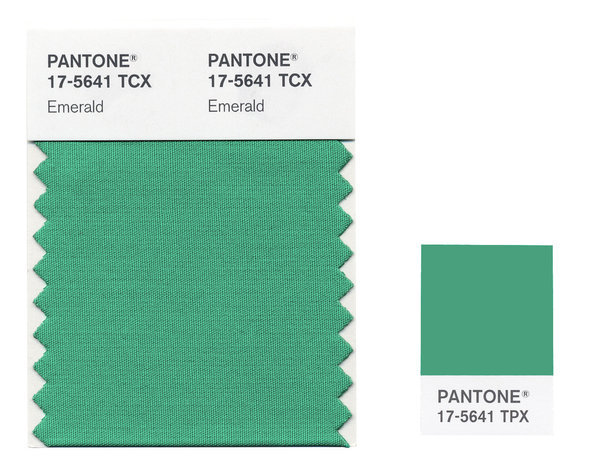
Leatrice Eiseman, the executive director of the Pantone Color Institute, declares that 'green is the most abundant hue in nature – the human eye sees more green than any other color in the spectrum... As it has throughout history, multifaceted Emerald continues to sparkle and fascinate. Symbolically, Emerald brings a sense of clarity, renewal and rejuvenation, which is so important in today’s complex world. This powerful and universally appealing tone translates easily to both fashion and home interiors.'
I'm fascinated by the idea of selecting a single colour to represent a year. Is it a kind of collective synaesthesia, or simply marketing? And how much influence does it actually have on the colours of products people buy? Apparently, each year a new colour is selected after a two-day conference in a European capital (this article in Slate has a fascinating report on the process), where a group of colour specialists decide on the hue which best represents the zeitgeist of the year ahead.
What do you think? Is emerald a good colour for 2013?
No comments:
Post a Comment